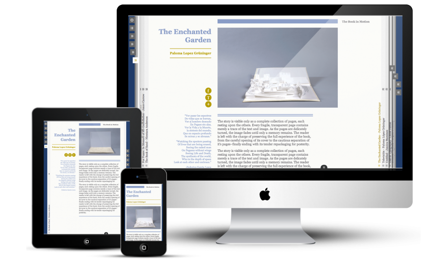
An interactive book to display experimental artist books created by students at The Cooper Union, School of Art, New York City
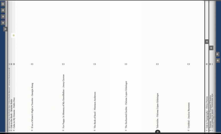
As the name tells, the book in motion is not only displaying all kinds of different book projects, but should also be a book itself. The design takes the name quite literally and aims to let the user feel as if fliping the pages of a book. But while resembling a book, it still takes full advantage of its non-pysical existence and modern web technologies. This allows the pages to spread out evenly to allow an easy overview over chapters and also transfroms the book in motion from a foliant on the desktop to a pocket book on the smart phone.
Details
Navigation
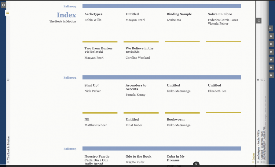
There is no conventional main navigation. Inspired by the physical book the next and previous pages can be access on the left and right hand side of the screen. To still be able to find a certain project quickly, the projects are categorized by chapters. Each chapter is represented by a divider between the pages. When clicking on one of these dividers one gets an overview of all projects within this chapter.


Responsive
The book in motion is fully responsive from larger screens down to a mobile version without JavaScript.
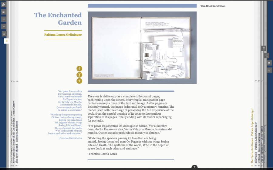
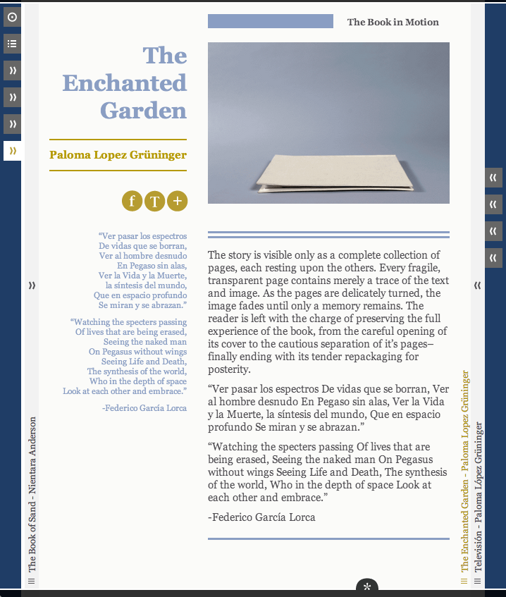
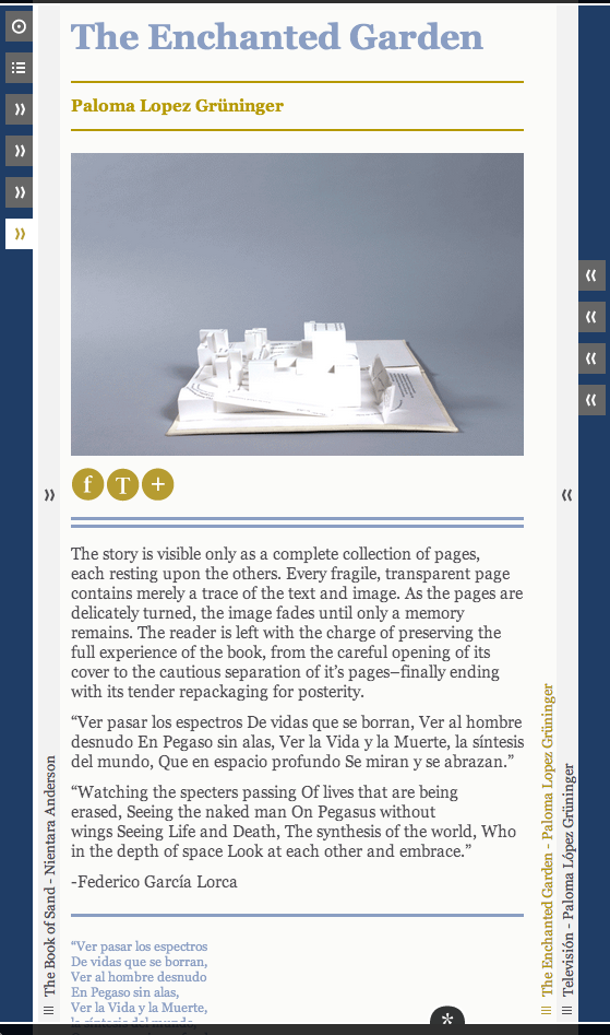
Gracefull degradation without JavaScript
And also even though the design relies heavily on JavaScript it degrades gracefully if JavaScript is not available. Here the mobile version:
